In this blog post, interop.io’s Director of Design and User Experience Tim Camuti discusses why UX designers should think beyond the boundaries of the application window and consider how all their users’ tools can fit together for a unified experience.
We all know that successful app developers and UX designers pay careful attention to the end-user experience within the boundary of the window that contains it. The standard requirements to exceed user expectations are lengthy: personalize the experience, emphasize usability, make the app “sticky” and so forth. There are hundreds of decisions to be made to get it right, and when it all comes together, a successful designer may feel that she’s created a true work of art.
But the truth is, no matter how well-designed the app is, the full experience extends beyond that window frame to the myriad of other tools users depend on to complete their workflow. What about when the static “work of art” is not enough?

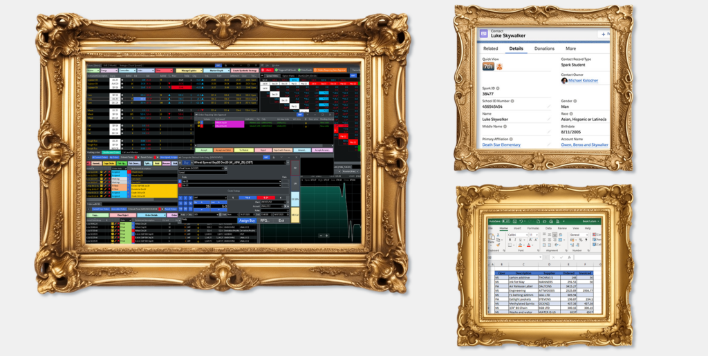
Applications can no longer be treated as static works of art
As product managers, engineers, and designers, we’ve solved our users’ problems by building apps for them over the years, and we’ve worked hard to make these apps both beautiful and intuitive. However, by creating an app for every problem, we’ve contributed to the app overload our users now suffer from. Because we’ve only considered the UX that happens within our app – and ignored what comes before and after our app – we’ve created fragmented user experiences across the set of applications required to complete a task.
Interoperability — the ability to connect disparate apps built in different technologies — has revealed a new world of possibilities. However, to deliver on the promise of seamless workflows between applications, we need to think differently about UX design itself. We can’t design our apps in silos anymore – apps are not works of art. User journeys across applications is where the user experience comes together.
In this post, let’s take a deep dive into the future of UX design and interoperability-including aggregate design and the unique user experience between applications.
The paths between applications
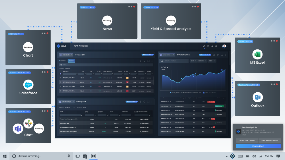
As the Director of Design and User Experience at a fintech specializing in interoperability, UX takes on a much wider (and more complex) scope for me and my team of designers. The interop.io solution gives users the power to pull together all their favorite “works of art” (or at least their most-used apps) to build an interactive “gallery” for intelligent workflow. Applications built in any language can participate, be it web or legacy (such as their OMS). Where historically our clients spent much of the workday toggling between disparate tech, we now see traders, portfolio managers and other specialists seamlessly syncing their apps, and with one keystroke populating data across an array of apps, screens, monitors, or mobile devices.

You can imagine the complexities when the user is stepping outside of the singular app and traveling between a multitude (see above diagram). The siloed thinking we’ve had in designing apps in the past doesn’t work when these boundaries start to dissolve. When work flows seamlessly between apps, we must extend our own thinking to meet end-users where they are headed: as conductors of their own destiny, who select what apps open when, saving workspaces then popping them back open, sharing these same workspaces, and even (for the Heads of Desk) gathering insights on these workflows and recreating them for other end users.
This is a defining moment for application developers and system integrators, as we must consider the path users take between our app and another, and naturally the relationship between these apps themselves. It’s crucial that we consider the workspace as many-to-many interactions — a varied ecosystem of user experience.
The aggregate design outlook
The key to creating the right path between these applications lies with aggregate design — which involves crafting a cohesive user experience that transcends individual app boundaries. This approach is defined by the user and varies from firm to firm based on what tools are in their arsenal. When we think about design in this way, we must put ourselves in the mind of the individual (or the firm’s goals for the individual trader, PM etc.) What are the overarching expectations? How can we guide the user seamlessly through different tasks across various apps?
It’s important to note that UI is an extremely important part of interoperability, but it is just the beginning. We want our users to find themselves within a cohesive environment (and it’s crucial to our product development and company vision, which is why we have a dedicated product design team). When users encounter familiar design elements as they move between apps, it creates a sense of trust and reliability, reinforcing their confidence in the platform’s ability to meet their needs.
Moving past UI, aggregate design outlook is about more than creating visually consistent interfaces, it’s about fostering a sense of familiarity and continuity that empowers users to focus on efficiency and reliability for speed and risk reduction. Some recent examples of applying aggregate design principles:
- A shift from application mindset to client mindset at JP Morgan. A user’s workflow starts not by choosing which application to open, but by clicking on a client or account. This sets the context, and the suite of relevant apps opens.
- Delivering an entire suite of apps at once to the end user. Hundreds of apps become available and can be built out into a manageable number of savable workspaces.
- Developing good defaults and using metrics (learn more about io.Insights) to discover what end users are using, changing, adding, and ignoring to lead to customized defaults (not necessarily user-designed).
Emphasis on bridging the user experience between apps
When users can effortlessly connect and complete tasks between different apps, the platform achieves a level of synergy that is a win-win for the end-user and ROI for the firm. After all, without end-user trust, your interoperability project can stall. Trust is of the utmost importance.
Effective UX between apps requires careful consideration of:
- Seamless Transitions:Users should feel like they’re traversing a single, interconnected environment rather than jumping between disjointed apps.
- Consistent Context:Each app should provide contextual information relevant to the user’s journey, maintaining a coherent narrative throughout.
- Shared Data:Interoperability relies on data being easily shareable and understandable across apps, ensuring users can make informed decisions.
- User Empowerment: The design should empower users to take control, letting them switch between tasks and apps on their terms, including saving and sharing workspaces. A question I like to think of here is, “What’s before and what’s next?” and, with that in mind, there must always be a home base to return to.

Achieving successful workflow automation through UX design
In an era where users demand a frictionless experience, interoperability platforms must embrace the entire user journey, no matter how varied and between which tools. By prioritizing seamless workflows, adopting an aggregate design outlook, and ensuring good UX between apps, platforms like interop.io can create a harmonious ecosystem that not only enhances user engagement but also leads to measurable firmwide ROI.
Applications may be works of art to the teams that built them, but to users, they’re means to an end – getting a job done – and end users are at the heart of what comes next for UX design. It’s their workflows that will inevitably contribute to what user experience in capital markets looks like in years to come.

